
Why Digital Maps Make Land Feel Simpler Than It Actually Is
Digital maps make land feel precise, understandable, and instantly accessible. But clean interfaces often hide the complexity of physical reality. A thoughtful look at why digital mapping can create false confidence.
5/4/20267 min read
Maps used to remind us that the world was larger than we understood.
Now they often suggest the opposite.
That sounds harsher than I mean it.
Digital maps are one of the most genuinely miraculous pieces of modern software. We carry planetary navigation infrastructure in our pockets and mostly use it to avoid wrong turns, estimate coffee shop travel times, or settle low-stakes arguments about whether that one place is actually closer than it feels.
This is progress.
And still.
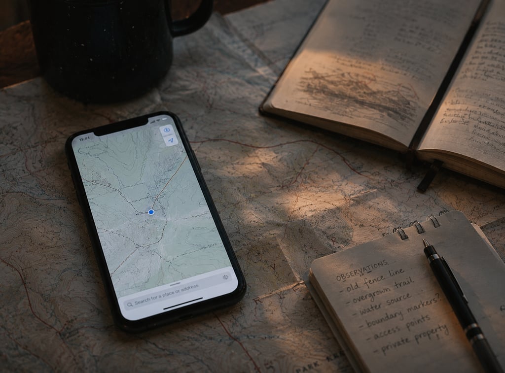
There’s something quietly strange about how confidently we interact with representations of physical reality now. You zoom in. Drop a pin. Inspect roads from above. Measure rough distance. Check parcel lines. Glance at terrain shading. Maybe even look at public overlays and convince yourself you’ve “understood” a place.
But software is very good at making interaction feel like comprehension.
Those are not always the same thing.
And land is one of the clearest places where that difference becomes obvious.
Eventually.
Translation
Software is, at its core, a translation layer.
That’s one of the things I like about it.
Reality is noisy, inconvenient, inconsistent, and often impossible to interact with directly at scale. Software takes some fragment of that mess and converts it into something navigable.
A dashboard translates operational complexity into charts.
A finance app translates market movement into digestible summaries.
A weather app translates atmospheric uncertainty into percentages and icons.
Maps translate geography into interfaces.
Translation is not deception.
It’s compression.
And compression is what makes modern tools usable.
The trouble starts when compression becomes emotionally indistinguishable from truth.
Because most interfaces are designed to reduce friction, not to preserve the full texture of the systems they represent.
That’s not a bug.
It’s the business model of usability.
Flatness
Digital maps make the world feel flatter than it is.
Not just physically.
Conceptually.
The problem is not that topographic tools exist. Terrain layers, elevation views, contour data, and satellite imagery have become astonishingly accessible.
The problem is how quickly our brains interpret visibility as understanding.
You can look at a parcel from above and feel clarity.
A shape appears.
Boundaries exist.
Road access seems obvious.
Nearby development provides context.
The experience feels definitive.
But physical land has a habit of remaining stubbornly physical.
It slopes.
Retains water.
Changes by season.
Feels different after rain.
Looks manageable until you’re standing in it.
Appears accessible from one angle and entirely different from another.
A map can show land.
That is not the same thing as knowing land.
Precision
Precision has an aesthetic.
Sharp lines.
Coordinates.
Overlays.
Labels.
Grid logic.
Numbers with decimals.
Software has taught us to associate visual precision with epistemic confidence.
If something looks measured, it feels authoritative.
This instinct is understandable.
Measured things often are authoritative.
But interface precision can be misleading because what looks exact may still be partial.
A parcel line can be visually precise while operationally incomplete.
A location marker can be accurate while contextually misleading.
Satellite imagery can be current enough to feel trustworthy while omitting realities that matter.
Precision is not the same thing as completeness.
Software rarely emphasizes that distinction because confidence improves usability.
Interfaces that constantly whisper uncertainty would be exhausting.
Still, the whisper matters.
Distance
Digital maps collapsed geographic distance in a way that changed how we think.
This happened gradually enough that it feels normal now.
You can inspect neighborhoods across the country while half-paying attention.
Zoom from state scale to property scale in seconds.
Estimate drive times casually.
Switch between overhead imagery and route logic as if physical space were simply another sortable data layer.
Psychologically, this changes something.
Distance becomes informational.
But physical distance remains experiential.
A road that looks close on a screen may feel operationally inconvenient in practice.
An access point that appears obvious from overhead may be far less straightforward in lived conditions.
Terrain can make proximity deceptive.
Infrastructure limitations can distort assumptions.
A map can tell you where something is.
That’s different from helping you understand what reaching it actually means.
The distinction is subtle until it becomes expensive.
Confidence
One of technology’s stranger side effects is confidence inflation.
A little access often feels like a lot of understanding.
This happens everywhere.
Analytics dashboards create fluency theater.
AI summaries create comprehension theater.
Financial apps create decision-confidence theater.
Maps create geographic certainty theater.
The interface becomes familiar, so the represented system feels familiar too.
That’s human, not stupid.
Familiarity lowers caution.
If you’ve successfully used mapping tools thousands of times for navigation, it becomes easy to generalize that confidence into adjacent assumptions.
The software worked before.
So the representation feels trustworthy now.
Often it is.
But trust in a tool is not the same thing as understanding every question you’re asking it to answer.
Terrain
Land is gloriously inconvenient.
That’s part of what makes this interesting.
Software likes regularity.
Interfaces reward simplification.
Land resists both.
A slope that looks mild from satellite perspective may feel dramatically different on foot.
Drainage patterns are not always emotionally obvious from overhead imagery.
Vegetation obscures realities.
Elevation nuance gets flattened.
Context gets compressed into visual suggestion.
Terrain layers help.
They do not replace lived interpretation.
Walking a place reveals things software rarely prioritizes.
Texture.
Footing.
Sightlines.
Water behavior.
Access friction.
Scale.
How the body experiences the environment matters.
Interfaces are optimized for information consumption.
Bodies are optimized for physical reality.
These are different epistemologies.
That sentence sounds more academic than intended, but I’ll keep it because it’s true.
Boundaries
Humans love boundaries.
Clean edges reduce ambiguity.
A parcel line on a screen scratches something deep in the certainty-seeking part of the brain.
There.
That’s the shape.
That’s the property.
Done.
Except boundaries are one of those places where representation and reality frequently diverge in interesting ways.
Not because maps are wrong.
Because interpretation is complicated.
Software makes boundaries legible.
It does not magically eliminate the historical, legal, environmental, or physical complexity surrounding them.
Information access is not interpretive mastery.
We increasingly blur those categories.
Because software made access feel democratic.
And access is genuinely valuable.
But value and fluency are not synonyms.
Interfaces
Interfaces don’t lie.
That’s too simplistic.
But they absolutely curate.
A weather app presents a model.
A route planner presents assumptions.
A productivity dashboard presents selective visibility.
Maps present representation.
The issue is rarely malicious intent.
The issue is interface design.
Interfaces prioritize usability.
Usability requires simplification.
Simplification requires omission.
Omission changes interpretation.
That chain matters.
A clean interface is not dishonest because it omitted friction.
It’s simply optimized around a different objective than full contextual fidelity.
The mistake happens when users forget that.
Which, to be fair, is easy.
Good interfaces are supposed to feel intuitive.
Intuition is not always understanding.
Ownership
This gets especially interesting when digital mapping intersects with ownership decisions.
Because information access changed behavior.
Public records, parcel tools, satellite imagery, terrain overlays, development context, zoning visibility. Research that once required meaningful friction now happens casually.
This is mostly good.
Democratized access generally beats gatekept opacity.
Still, access changes psychology.
Seeing information creates confidence.
Confidence influences decisions.
And decisions built on partial confidence can be structurally fragile.
Knowing something exists is not understanding its implications.
Seeing access is not validating access.
Viewing context is not fully grasping context.
Interpretation remains its own discipline.
That’s why organizations working in physical land realities still matter despite extraordinary digital tooling. Firms like The Land Consultants exist in the practical gap between what digital representations make visible and what real-world land understanding actually requires.
That isn’t an indictment of software.
It’s a reminder of software’s scope.
Speed
Technology trains us toward speed.
Check quickly.
Assess quickly.
Decide quickly.
Move on.
Friction feels inefficient.
Slowness feels antiquated.
But some forms of understanding refuse acceleration.
You can inspect metadata rapidly.
You can visualize terrain instantly.
You can access parcel context in moments.
Understanding what matters may still require slower cognition.
This is frustrating because software conditioned us to expect otherwise.
Fast visibility feels like fast comprehension.
Sometimes it is.
Sometimes it absolutely is not.
Land is one of those domains where physical complexity quietly punishes speed-thinking.
Compression
Compression is software’s superpower.
And occasionally its trap.
Complex systems become usable because abstraction hides overwhelming detail.
That’s the deal.
No one wants routing software exposing every infrastructure dependency every time they need coffee.
Abstraction is humane.
But humane abstractions can create false certainty when users forget what has been removed.
Compression preserves utility.
It does not preserve totality.
That distinction feels philosophical until real decisions depend on it.
Context
Context is what interfaces struggle to express elegantly.
Not because designers are careless.
Because context is relational.
Historical use matters.
Environmental behavior matters.
Jurisdictional nuance matters.
Seasonal conditions matter.
Human usage patterns matter.
Adjacent realities matter.
Context does not compress cleanly.
Which makes it difficult to represent beautifully.
Interfaces prefer cleaner truths.
Reality prefers messier ones.
Scale
Zooming creates a peculiar illusion.
At broad scale, places feel abstract.
At close scale, places feel knowable.
Neither impression is fully reliable.
Zoom changes visibility, not necessarily understanding.
Looking closer is not always learning more.
Sometimes it just increases confidence.
This is not a maps problem.
It’s a human cognition problem accelerated by interface design.
We mistake access for intimacy.
Repeatedly.
The Programmer Problem
As someone shaped by technical thinking, I find this tension oddly familiar.
Software builders live inside abstractions.
APIs abstract systems.
Frameworks abstract complexity.
Interfaces abstract workflows.
Good abstractions make impossible things manageable.
But every abstraction leaks eventually.
That old engineering phrase applies beautifully here.
All abstractions leak.
Maps included.
The leak happens where lived reality exceeds what the representation anticipated.
That isn’t failure.
It’s architecture.
Still, remembering that helps.
Humility
The deeper lesson here is not anti-technology.
That would be lazy.
Digital maps are extraordinary.
The issue is humility.
Useful tools deserve trust within scope.
The trouble begins when trust expands beyond scope unnoticed.
A polished interface can make complexity feel solved.
Sometimes complexity has simply been made tolerable.
That’s different.
Humility is recognizing the distinction.
The Strange Comfort of Clean Lines
Clean lines feel emotionally reassuring.
Defined shapes suggest certainty.
Neat boundaries reduce anxiety.
This is partly aesthetic, partly psychological.
Humans like order.
Digital maps deliver order beautifully.
Reality remains less cooperative.
And maybe that’s the whole point.
Not that maps fail.
That they succeed so well at simplification that we occasionally forget simplification happened.
The Takeaway
Digital maps make land feel simpler because simplicity is exactly what interfaces are designed to create.
That’s their job.
The mistake happens when usability gets mistaken for completeness.
When visual clarity becomes interpretive confidence.
When representation feels interchangeable with reality.
Maps are astonishing tools.
But tools remain translations.
And translations, however elegant, are still one step removed from the thing itself.